In this guest post, our friends at StudioBinder explore how color influences a film, and how you can use color theory to tell your story, shape characters, and evoke emotion.
Considering cinema’s origin in black and white, it’s not surprising that many filmmakers have an obsession with color in films. From wardrobe choices and color gels to post-production filters and fonts, movie color schemes play a vital role in a director’s vision.
The importance of color in film
Lewis Bond’s color theory video, Color In Storytelling, posted on Channel Criswell, is not only a practical analysis of how movie color palettes enhance storytelling, but also an engaging historical recap on the maturation of color in film.
Before we begin, check it out:
How can color tell a story?
Simply put, color can affect us emotionally, psychologically, and even physically, often without us being aware. Color in film can build harmony or tension within a scene, or bring attention to a key theme. When telling a story, colors can …
- Elicit psychological reactions with the audience
- Draw focus to significant details
- Set the tone of the movie
- Represent character traits
- Show changes or arcs in the story
As filmmakers, we must choose our film palette carefully to maximize emotional and visceral effect. You can learn how to choose the right color scheme by downloading the color theory ebook.
The psychological effect of color in films
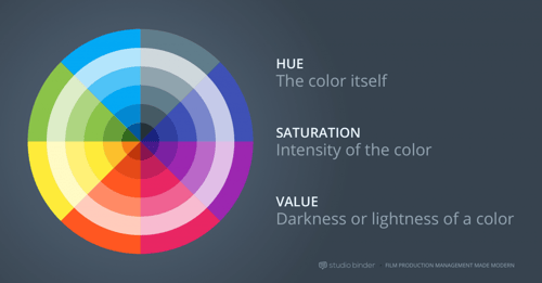
When chosen carefully, a well-placed movie color palette evokes mood and sets the tone for the film. The three main components of a color are:
- Hue — the color itself
- Saturation — intensity of the color
- Value — darkness or lightness of a color
As Bond mentions in his color theory video, many viewers will have predictably similar reactions to certain colors. A strong red color has been shown to raise blood pressure, while a blue color elicits a calming effect.
This beautiful video by Lilly Mtz-Seara illustrates the psychology behind specific colors in film:
For example, in The Sixth Sense, M. Night Shyamalan uses red to represent fear, dread, and foreshadowing, whereas in Pleasantville, Gary Ross uses red to represent hope, love, and sensuality. Color theory norms should be understood by filmmakers, but never seen as a limitation.
Balanced movie color palettes
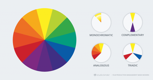
Although single, recurring colors can hold a deeper meaning, a more fleshed-out film palette of colors (a.k.a. “color scheme”) is most effective in communicating the thematic context. Balanced movie color schemes refer to the harmonious relationships of colors on a color wheel.
A balanced movie color palette creates unity and promotes a cohesive tone. The four most common types of color schemes are described below.
Monochromatic
Monochromatic color schemes come in shades of a single color such as red, dark red, and pink. They create a deeply harmonious feeling that is soft, lulling, and soothing.

The Grand Budapest Hotel (2014)

The Grand Budapest Hotel (2014)
The Matrix is another good example of a monochromatic movie color scheme. Nearly every scene set within the world of the Matrix has a green hue. Shades of green permeate everything in the frame to create an unnatural, lulling effect (representative of those “asleep” inside the Matrix).

The Matrix (1999)

The Matrix (1999)
Complementary
Contrasting drama (i.e., warm vs. cool). Complementary colors live opposite each other on the color wheel. For example, orange and blue are complementary colors commonly used in many blockbuster films. The dueling colors are often associated with conflict, whether internal or external. No matter the color selection, complementary colors combine warm and cool colors to produce a high-contrast, vibrant tension in the film.

Amélie (2001)
Analogous
Analogous colors neighbor each other on the color wheel (e.g., red/violet or yellow/lime green). Since the colors don’t have the contrast and tension of the complementary colors, they create an overall harmonious and soothing viewing experience. Analogous colors are easy to take advantage of in landscapes and exteriors as they are often found in nature.
One color can be chosen to dominate, a second to support, and a third (along with blacks, whites, and grey tones) to accent.

Children of Men (2006)

Children of Men (2006)

Tokyo Drifter (1966)

Traffic (2000)
Triadic
Vibrant and colorful, triadic colors are three colors arranged evenly spaced around the color wheel (e.g., red, blue, and yellow). One color should be dominant and the others accented. Triadic is one of the least common movie color schemes, but it can be striking and vibrant even when the hues are unsaturated.

A Woman Is a Woman (1961)

Pierrot le Fou (1965)

Superman (1978)
Discordant movie color palettes
Discordance is a deliberate choice by the director to deviate from the balanced movie color schemes mentioned above to refocus attention. Discordant colors can help a character, detail, or moment stand out from the rest of the film. For example, blue in Amélie, or red in The Sixth Sense. You can download this free e-book to learn about color theory.

Amélie (2001)

Pleasantville (1998)

Schindler’s List (1993)

Sin City (2005)
Enhancing the symbolism in your film color palette
Associative
When a recurring film palette or color represents a character or larger theme in the film, it’s associative.

Castello Cavalcanti (2013)

The Dark Knight (2008)

The Godfather (1972)

Inside Out (2015)

Kill Bill: Vol. 1 (2003)

Star Wars: Episode V – The Empire Strikes Back (1980)

Vertigo (1958)
Transitional
When a transformation — in story, character, or theme — is conveyed through a shifting color scheme, it’s transitional.

Breaking Bad (2008–13)
Tokyo Drifter (1966)

Up (2009)
Wrapping Up
While many movie color schemes can exhibit a “universal” effect on audiences, there’s really no magic bullet or “right” answer when it comes to selecting your movie color palette. Ultimately it’s up to the filmmaker to define the implications of the film palette. With that said, looking to universal color theory is an all-important first step.
To see more examples of color in films, check out Movies in Color. For another deep look on the big impact of small visual choices, check out our essay 6 ways to turn props into iconic characters.
Learn how to choose the right color scheme for your project — download StudioBinder’s free e-book “How to Use Color in Film” now.
About StudioBinder
StudioBinder is the world’s most intuitive film production management service. Create and share script breakdowns, shooting schedules, shot lists, storyboards, personalized call sheets, and more. Find out more at studiobinder.com, and follow them on Facebook and Twitter.
Banner image: Still from a clip by Uberstock
Posted by
Dissolve
Dissolve Premium (dissolve.com) has been the go-to for quality stock footage and photos by the world's top creative agencies and production houses. Some of the best filmmakers and stock producers from around the world are with Dissolve — our rapidly growing collection of unique, compelling footage is a testament to that. In addition to our quality stock footage and photography business, we launched Dissolve Creators (dissolve.com/creators/community). A platform for photographers, filmmakers, producers, and designers to connect and share their work as free downloadable content. We offer these creatives (amateur or pro) a bridge to our clientele, gig opportunities, networking opportunities, as well as our knowledge of the stock industry.


.png)
.png)
.png)
