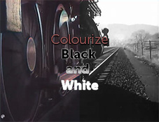
Video thumbnails are one of the most important aspects of your YouTube channel. They are the first thing that potential viewers will see, so they need to be eye-catching and engaging in order to get them to click on your video.
Why are video thumbnails important?
There are a few reasons why video thumbnails are so important. First, they are the first thing that potential viewers will see when they are browsing through YouTube. If your thumbnail is not eye-catching, they are likely to scroll past your video and never even give it a chance.
Second, thumbnails can help to increase your click-through rate (CTR). A higher CTR means that more people will click on your video, which will lead to more views and more subscribers.
Third, thumbnails can help to improve your search engine ranking. When people search for videos on YouTube, your thumbnail will appear in the search results. If your thumbnail is relevant to the search terms, it is more likely to be clicked on, which will improve your ranking.
Here are some video thumbnails for our showreels.
How to create an engaging video thumbnail
There are a few things you can do to create an engaging video thumbnail:
-
Use high-quality images. Your thumbnail should be clear and easy to see. Avoid using blurry or pixelated images.
-
Use contrasting colors. This will help your thumbnail to stand out from the rest.
-
Include a short and catchy title. Your title should give viewers a good idea of what your video is about.
-
Use emojis. Emojis can be a great way to add personality to your thumbnail and make it more eye-catching.
-
Use white space. White space can help to make your thumbnail more visually appealing.
-
Test different thumbnails. Once you have created a few different thumbnails, test them out to see which one performs the best.
When selecting images for video thumbnails, it's essential to choose visuals that capture attention, convey the video's content, and entice viewers to click and watch. Here are some types of images that tend to work well in video thumbnails:
-
Eye-catching Keyframes: Select a visually striking keyframe from the video that represents the overall theme or captures a compelling moment. It should be clear, visually appealing, and arouse curiosity.
-
Expressive Faces: Including a close-up of a person's face, especially if they display strong emotions or engaging expressions, can create a sense of connection and intrigue.
-
Vibrant Colors: Using images with vibrant and contrasting colors can make the thumbnail stand out and catch the viewer's eye amidst a sea of other videos.
-
Bold Text or Graphics: Overlaying bold text, graphics, or icons on the image can help communicate the video's topic or main message. This can be particularly effective when combined with an engaging image.
-
Action or Movement: Showcasing dynamic and visually captivating action or movement in the thumbnail can generate interest and make viewers curious to see more.
-
Clear Visual Hierarchy: Ensure that the main subject or focal point of the image is easily distinguishable, with clear composition and visual hierarchy to guide the viewer's attention.
-
Branding Elements: Incorporating subtle branding elements, such as a logo or consistent color scheme, can help reinforce your channel's identity and improve recognition among viewers.
Remember to consider the thumbnail's composition and ensure that the image is of high quality, well-lit, and visually appealing. Experiment with different image types and monitor the thumbnail's performance to optimize its effectiveness in attracting viewers.
What is the aspect ratio for video thumbnails?
The aspect ratio for video thumbnails is 16:9. This means that for every 16 pixels wide, your thumbnail should be 9 pixels tall. YouTube will automatically resize your thumbnail to fit this aspect ratio, but it's best to upload your thumbnail at the correct size in order to avoid any quality loss.
What image format is suitable for video thumbnails?
The following image formats are suitable for video thumbnails:
-
JPG (Joint Photographic Experts Group)
-
GIF (Graphics Interchange Format)
-
PNG (Portable Network Graphics)
These formats are all supported by YouTube and will be displayed correctly in the player. It is recommended that you use a JPG or PNG file for your thumbnail, as these formats are generally smaller in size than GIF files. This will help to improve the loading time of your video.
The ideal size for a video thumbnail is 1280 x 720 pixels. This size will ensure that your thumbnail is displayed at its best on all devices, including desktops, laptops, tablets, and smartphones.
When creating your video thumbnail, be sure to use high-quality images and text that is easy to read. You can also use emojis and other graphics to make your thumbnail more eye-catching.
How much text should there be in a video thumbnail?
There is no one-size-fits-all answer to this question, as the amount of text that you should include in your video thumbnail will depend on a number of factors, such as the type of video you are creating, your target audience, and your branding. However, there are a few general tips that you can follow to help you decide how much text to include in your thumbnails.
-
Keep it short and sweet. People are more likely to click on a thumbnail that is easy to read and understand. Avoid using long, complicated sentences or phrases.
-
Use keywords. When choosing text for your thumbnail, be sure to include relevant keywords that people are likely to search for. This will help your video to appear in search results.
-
Use contrasting colors. This will help your text to stand out from the background of your thumbnail.
-
Use a call to action. Tell viewers what you want them to do, such as "Click here to learn more" or "Subscribe now!"
To maximize legibility, it's important to prioritize readability and clarity. Here are some suitable font options and recommended sizes:
-
Fonts:
- Sans-serif fonts like Arial, Helvetica, or Open Sans are generally a safe choice for legibility.
- If you prefer a more stylized look, consider fonts like Roboto, Montserrat, or Lato, which offer a good balance of readability and visual appeal.
-
Sizes:
- Headline or main text: Aim for a font size of 36-48 pixels or larger, depending on the thumbnail dimensions and the length of the text.
- Subtitles or secondary text: Opt for a font size of 20-28 pixels, ensuring it is readable when displayed at a smaller size.
Remember to consider the aspect ratio and overall composition of the thumbnail. The font size should be adjusted accordingly to maintain readability, especially when the thumbnail is viewed in smaller sizes or on mobile devices. Additionally, using bold or slightly increased letter spacing can enhance legibility, especially for smaller font sizes.
Ultimately, the best way to determine how much text to include in your video thumbnail is to experiment and see what works best for you. Create a few different thumbnails with different amounts of text and see which one performs the best.
Posted by
Bradley Brunton

.png)
.png)
.png)


