We love the web, but even in this virtual age you sometimes need to make a physical impression — something to leave on people’s desks or put in their mailboxes.
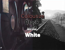
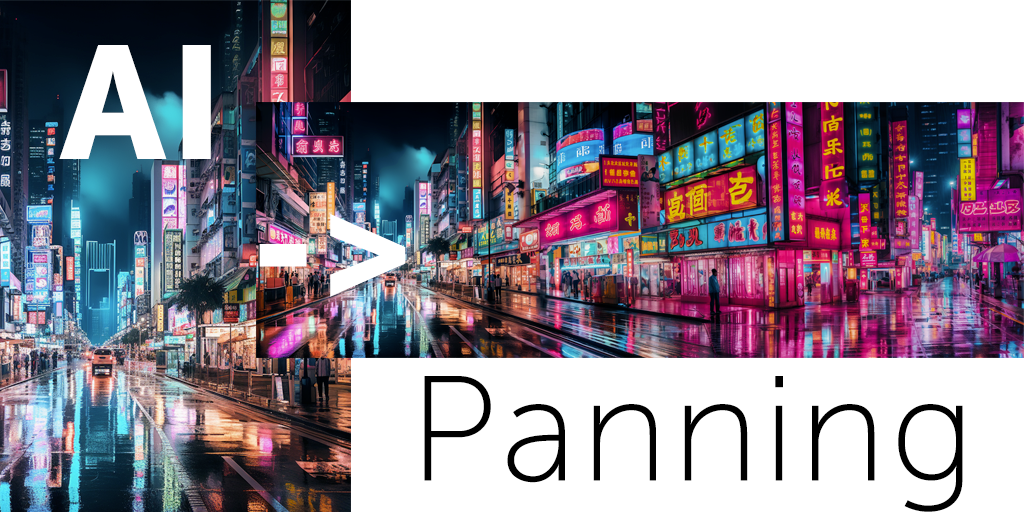
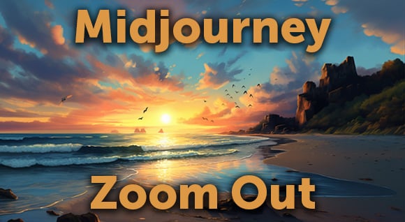
For our very first Dissolve printed piece, we looked for an innovative way to show “motion.” Our good friends at Blanchette Press showed us a sample that got our attention. We modified the idea for several pages of the catalog.
The motion effect is created by dragging a vertically ruled overlay over an image. Each clear gap reveals only one segment of the animation at a time, with the black lines blocking the others. It’s like a lenticular image, only flattened. (As a bonus, the flattened sequence looks pretty cool too.)
It took a lot of trial and error for us to find the optimal setup for the animations. We settled on vertical gaps that were one-quarter the width of the bar, for a good balance of visibility and smoothness.
If you’re really determined, you can use this PSD file to make your own — just replace each screen-capture layer with a frame from your own video. Good luck!
Posted by
Jon Parker
.png)
.png)
.png)
